Brand identity
Strong brand identity for Concept Lab Torino
With decades of experience in manufacturing engineering, Concept Lab Torino, previously known as RS21, needed a new brand identity to reflect its expertise and connection to the local territory.
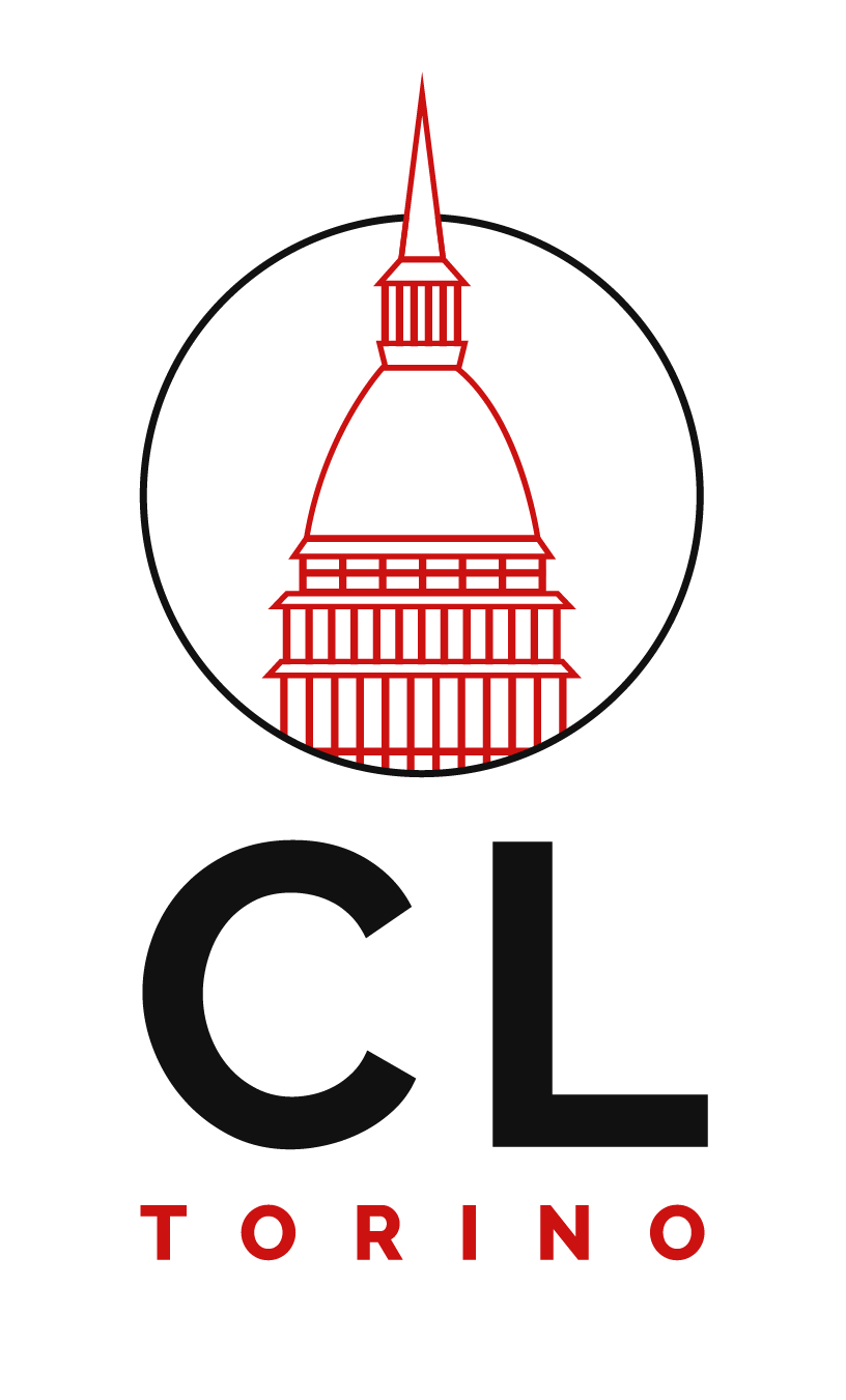
My job was to craft a modern logo, inspired by the iconic Mole Antonelliana in Turin (Italy), and develop a comprehensive brand package that included:
- A modern logo inspired by the local area
- A distinctive and new colour palette
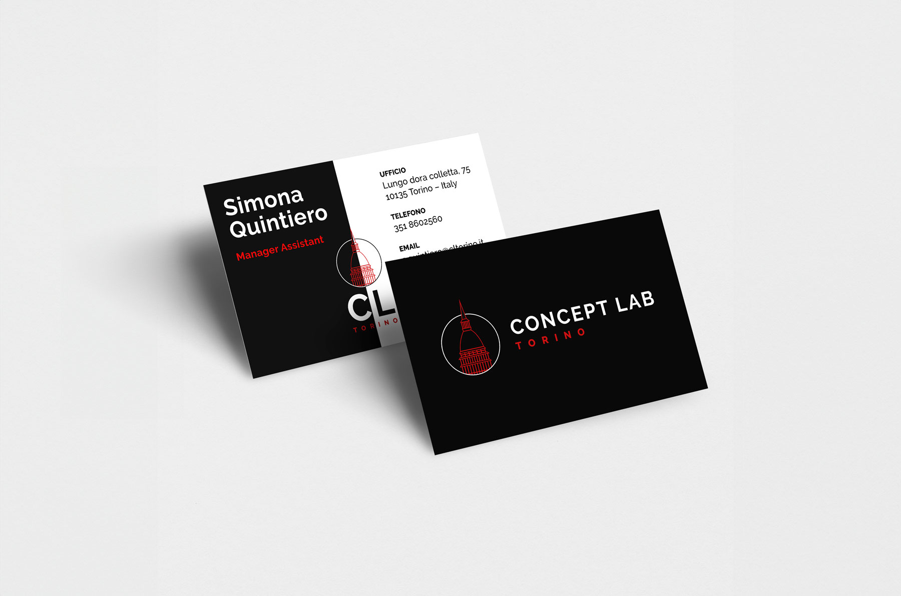
- Unique business card ready for print
- Email signature design and file setup for Outlook
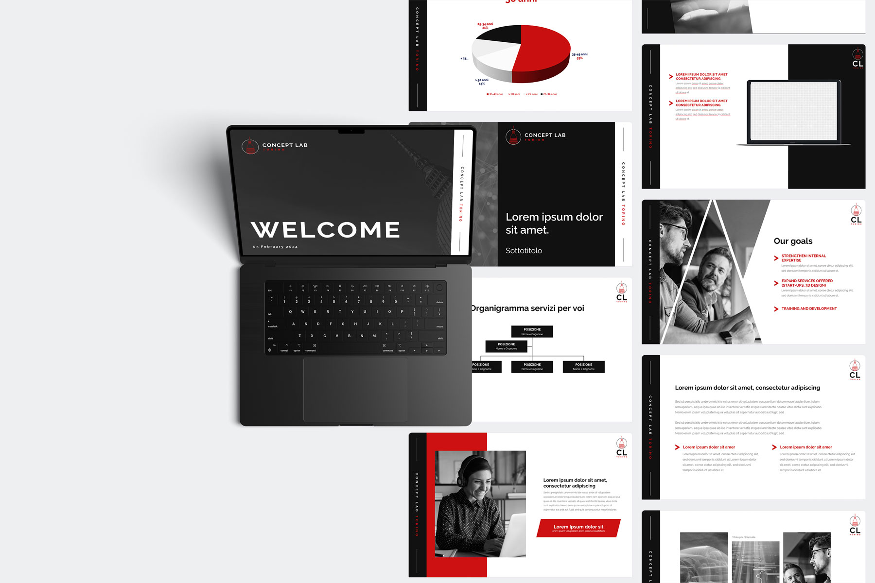
- PowerPoint presentation and Word document template

Night
CMYK 79, 70, 62, 89
RGB 17, 17, 17
HEX #111111
White
CMYK 79, 70, 62, 89
RGB 17, 17, 17
HEX #111111
Engineering orange
CMYK 12, 100, 100, 3
RGB 204, 17, 17
HEX #CC1111
A bold, modern identity rooted in tradition that captures the essence of Concept Lab Torino
With meticulous attention to detail and a commitment to excellence, the logo for Concept Lab Torino captures the essence of the company’s deep connection to the region and its forward-thinking vision.
The expansion and renovation project honours the rich history of Turin’s Gallery while embracing the future, ensuring that this city landmark remains a source of inspiration.

Graphic mark
The Mole Antonelliana is crafted with a geometric elegance, defined by clean, precise lines. This modern interpretation reflects the company’s innovative approach while maintaining a timeless, minimalist appeal.
Uniqueness
The bold design leaves an immediate and lasting impression, setting Concept Lab Torino apart with a distinctive look that’s both memorable and meaningful. This uniqueness reinforces the brand’s identity and makes it easily recognisable across all platforms.
Symmetry
A perfectly symmetrical design brings a sense of harmony and balance, echoing the strength and stability of Concept Lab Torino. This refined approach ensures that the brand communicates confidence, cohesion, and clarity.


Client: Concept Lab Torino (formerly RS21)
Project: Brand Identity Development
Sector: Product and Manufacturing Engineering
The Challenge
Concept Lab Torino, a well-established company with decades of experience, required a complete rebrand to reflect its evolution from RS21 and maintain its connection to the local region. The aim was to develop a new brand identity that resonated with the company’s core values of precision, innovation, and regional pride, while preserving its strong presence in the product and manufacturing engineering industry.
My Approach
The rebranding process was centred around creating a fresh, modern identity that would distinguish Concept Lab Torino in the marketplace. The design was rooted in the company’s heritage while positioning them as forward-thinking and adaptable to the future.
Key elements of the brand identity included:
- Logo Design
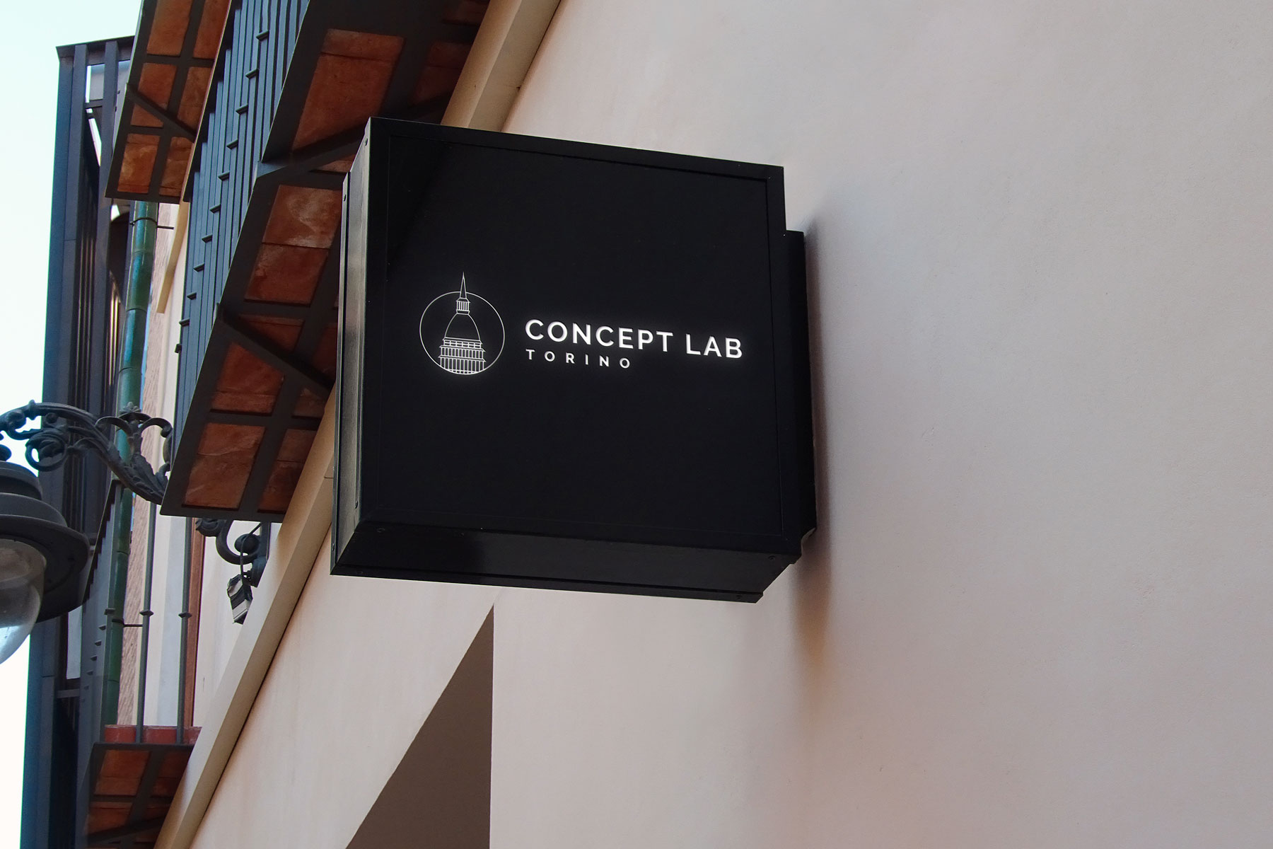
A minimalist, geometric representation of the iconic Mole Antonelliana, symbolising the company’s strong connection to Torino. - Colour Palette
A bold yet sophisticated palette, balancing engineering orange and deep shades, to convey both vitality and professionalism. - Business Card Design
Clean and professional, integrating the new logo and brand colours for consistency. - PowerPoint Presentation Template
A cohesive, visually striking template that aligns with the brand’s identity, providing consistency across all business presentations. - Email Signature and Outlook Setup
A sleek design paired with functional setup for Outlook, ensuring a polished brand presence in digital communication.
The Result
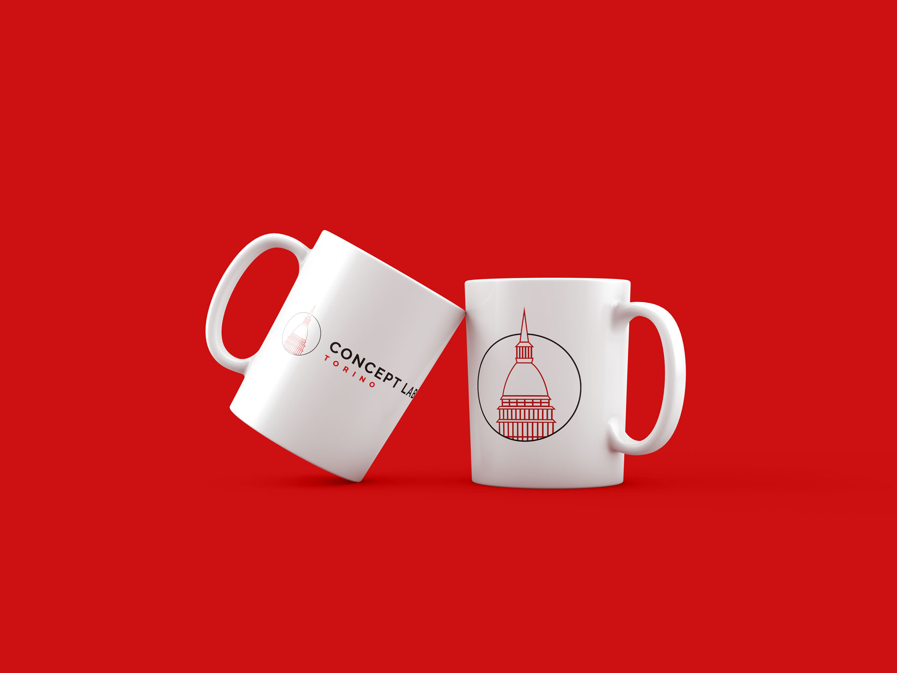
The new brand identity for Concept Lab Torino successfully captured the essence of the company’s local roots and its bold approach to the future. The cohesive brand elements have strengthened their visual identity, enabling Concept Lab Torino to communicate with clients and partners in a more professional and unified manner. The result is a brand that is recognisable, memorable, and reflective of their expertise and dedication to excellence.
FAQs
Can you work with my existing branding?
Absolutely. As a web designer, it’s essential to adhere to brand guidelines and enhance them where possible. I tailor my approach based on your organisation’s needs, ensuring consistency while evolving the brand as necessary.
What is your design process?
If you’re interested in working with me, the first step is to get in touch and share your ideas. After a quick discovery call, I’ll provide tailored advice on what will work best for your business and outline the next steps.
What services do you offer?
I offer a range of services, including branding, logo design, website design, website maintenance, and more specialised tasks such as coding adjustments or setting up email signatures.
What information do you need from me to start a project?
The more information, the better! This could include branding guidelines, website content, design inspirations, or any specific preferences you have. These details help me understand your vision and create something that aligns with your goals.
