logo design
Crafting an elegant logo for My Glow Clinics
My Glow Clinics is a beauty clinic that offers hair loss treatments, beauty services, and non-surgical cosmetic procedures. As they transitioned from a freelance setup to a larger scale, they needed a new logo to reflect their professional growth and high standards of care. My Glow Clinics sought a design that would be modern, elegant, and instantly recognisable in both print and digital formats.
Deliverables:
- Multiple logo concepts
- Social media logo
- Versions for print and online use
- Color palette analysis
- Variants for light and dark backgrounds



Client: My Glow Clinics
Project: Logo Design
Sector: Beauty Treatments
The Challenge
To create a logo that truly represented My Glow Clinics, I needed to delve into the brand’s values, target audience, and vision for future growth. The clinic needed a design that conveyed luxury and sophistication while being warm and approachable. It was essential for the logo to feel minimalistic and modern, yet instantly recognisable across both print and digital spaces. Additionally, the design had to adapt seamlessly to various platforms, reflecting the high standards and professional image that My Glow Clinics aimed to establish in the beauty and wellness industry.
My Approach
To create a logo that would represent My Glow Clinics’ values and aspirations, I began by exploring design elements that would convey luxury, professionalism, and care in a minimalistic and modern way.
My goal was to develop a logo that could adapt across various platforms and stand out in a highly competitive beauty industry. I aimed for a design that was not only elegant and recognisable but also technically versatile for use in both print and digital environments. By carefully balancing visual appeal with functional adaptability, I ensured that the logo would meet the clinic’s current needs and support its future growth.
Key Aspects Delivered:
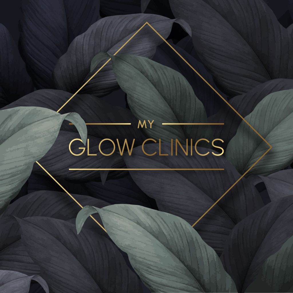
- Minimal, Modern Layout: A geometric structure featuring two parallel lines framing “Glow Clinics” with “My” nestled within the top line for a balanced and refined look.
- Color Research and Recommendations: Gold for luxury, with alternatives for print in rich yellow. Paired gold with dark green and black for contrast, and light green for a fresh, natural touch.
- Versatile Formats: Delivered versions for both print and digital, including a flat gold version for print, a vibrant digital version, and round social media icons.
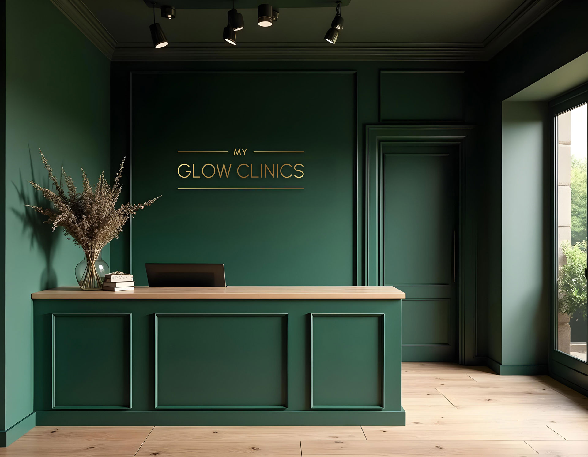
- Optimisation for Backgrounds: Provided logo versions suitable for light and dark backgrounds to ensure readability and recognisability across all contexts.
The Result
The final logo for My Glow Clinics achieved a refined balance between elegance and functionality, perfectly embodying the clinic’s high standards and commitment to care.
On a technical level, careful consideration was given to ensure that the chosen gold color remained legible and vibrant against darker backgrounds, such as black or dark green. This specific tone of gold avoids the issue of appearing dull or washed out, ensuring the brand’s message of luxury and elegance remains clear in both digital and print formats.
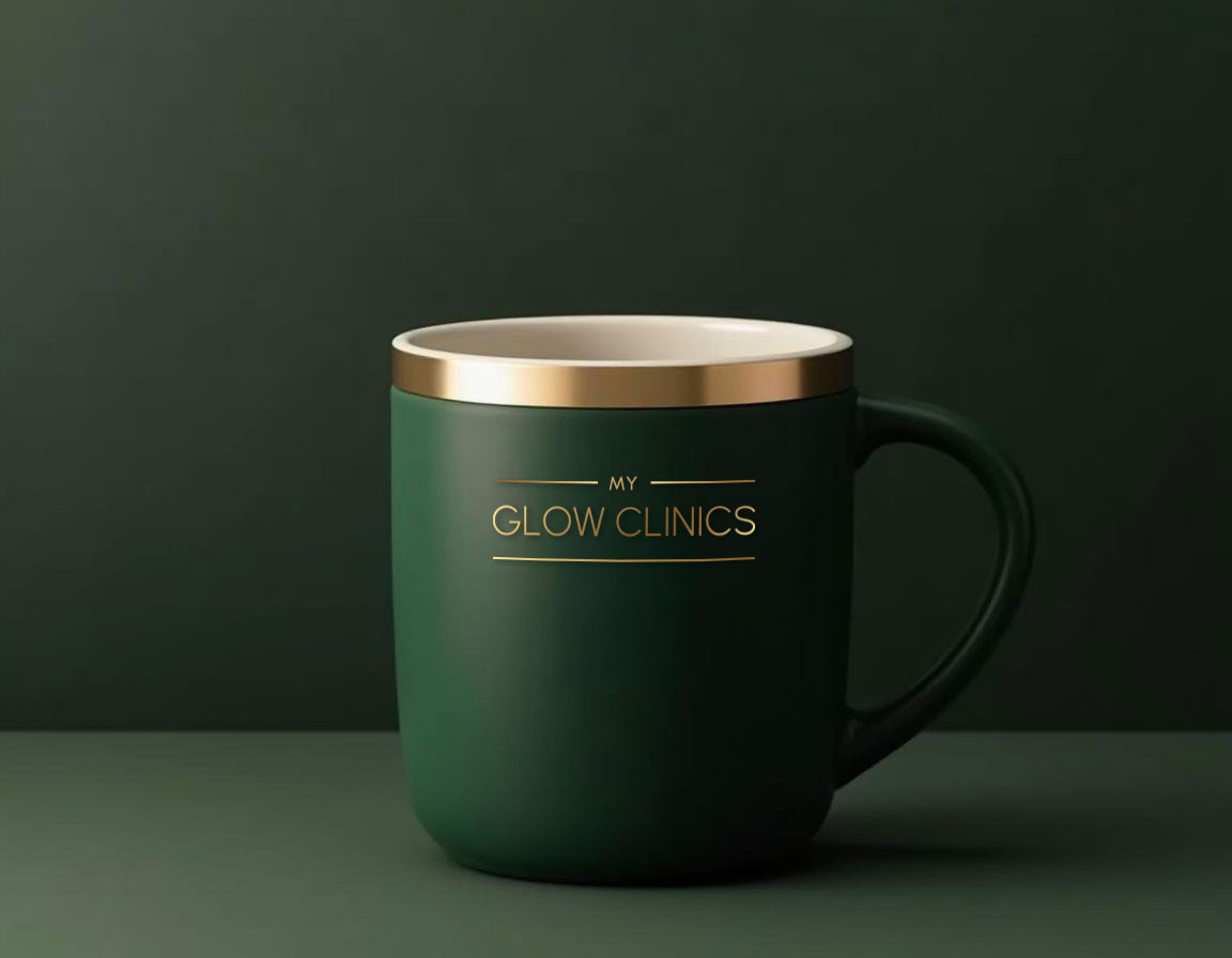
Additionally, I provided My Glow Clinics with logo versions optimised for various applications: a standard digital gold for online use, a flat gold for print, and adaptations for light and dark backgrounds. These tailored versions mean the logo maintains its impact and recognisability across all formats, ensuring it performs beautifully whether displayed on social media, clinic signage, or printed materials.
Antique Gold
CMYK 20, 30, 66, 7
RGB 202, 169, 100
HEX #CAA964
Saddle Brown
CMYK 33, 53, 84, 34
RGB 138, 98, 46
HEX #8A622E
Vintage Bronze Glow
A linear gradient from Antique Gold to Saddle Brown. This gradient creates a warm, earthy transition with a vintage bronze effect.
Deep Teal Green
CMYK 91, 50, 69, 69
RGB 3, 48, 41
HEX #033029


FAQs
Can you work with my existing branding?
Absolutely. As a web designer, it’s essential to adhere to brand guidelines and enhance them where possible. I tailor my approach based on your organisation’s needs, ensuring consistency while evolving the brand as necessary.
What is your design process?
If you’re interested in working with me, the first step is to get in touch and share your ideas. After a quick discovery call, I’ll provide tailored advice on what will work best for your business and outline the next steps.
What services do you offer?
I offer a range of services, including branding, logo design, website design, website maintenance, and more specialised tasks such as coding adjustments or setting up email signatures.
What information do you need from me to start a project?
The more information, the better! This could include branding guidelines, website content, design inspirations, or any specific preferences you have. These details help me understand your vision and create something that aligns with your goals.
